Creator Response Color Deficiency

jak7217

Greenhorn
Just got the game last night and have set up the board and read all the rules. The animation looks great, but I am finding that my color deficiency is getting in the way of experiencing the full game. Immediately, I cannot tell the color of the crow or the blue v purple pawn. Nothing game breaking, but something to consider for future versions.

Well done and I am excited to try this with my wife tonight!
 

Colito

Board Game Designer
Staff member
This is very good feedback! We tried really hard to keep this in mind to make the game accessible, but if possible I may try and add a shape difference to the crow icons especially. And perhaps we'll consider pawns with greater contrast for the blue and purple. Thank you for sharing this concern!
 

tbowne85

Tiller
This is very good feedback! We tried really hard to keep this in mind to make the game accessible, but if possible I may try and add a shape difference to the crow icons especially. And perhaps we'll consider pawns with greater contrast for the blue and purple. Thank you for sharing this concern!
I'm glad somebody posted about this as well. I was going to make a post about it myself considering I have vision deficiencies as well. One particular problem I run into is the colors of the foraging tiles. The blue and the green specifically can be hard to differentiate for me. Adding a simple symbol on both sides of the foraging tiles would help a lot.

I also find it hard at times to tell the difference between the red and green color crow icons so a different shape would help a lot. I hope in the future when you decide if you will make revisions to the game if you consult some people with vision deficiencies and use their input. That would benefit many people.
 

Colito

Board Game Designer
Staff member
Originally we had a symbol on the back of the Forageable tiles, maybe we'd add it back in. And the crows could have different shapes to their icons perhaps. This was what I did for the fishing locations specifically for folks that may have trouble with the different colors.
 

tbowne85

Tiller
Originally we had a symbol on the back of the Forageable tiles, maybe we'd add it back in. And the crows could have different shapes to their icons perhaps. This was what I did for the fishing locations specifically for folks that may have trouble with the different colors.
Yes adding in the season symbol to both sides of the foraging tiles would help.

And you definitely made a good call with the different shapes for the different bodies of water for fishing tiles. It does help a lot.
 
@jak7217 and @tbowne85 , while it won't affect your physical copy, could I help any with the TTS module I made?

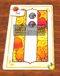
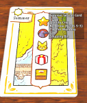
Dunno if you would find it useful, but I could add a description to each card saying what each icon is (Red Crow, Move Fish, etc) when you hover over the season card. I could add one to all the pawns as well.

Would you also want me to make the Red and Green crow say what spaces they affect as well in the tooltip. I don't know how well you can see the colors on the colored Crow Bar.
 

tbowne85

Tiller
@jak7217 and @tbowne85 , while it won't affect your physical copy, could I help any with the TTS module I made?

Dunno if you would find it useful, but I could add a description to each card saying what each icon is (Red Crow, Move Fish, etc) when you hover over the season card. I could add one to all the pawns as well.

Would you also want me to make the Red and Green crow say what spaces they affect as well in the tooltip. I don't know how well you can see the colors on the colored Crow Bar.
Yes I'm sure those would help many people.
 
Top