DerpyBurgerz
Newcomer
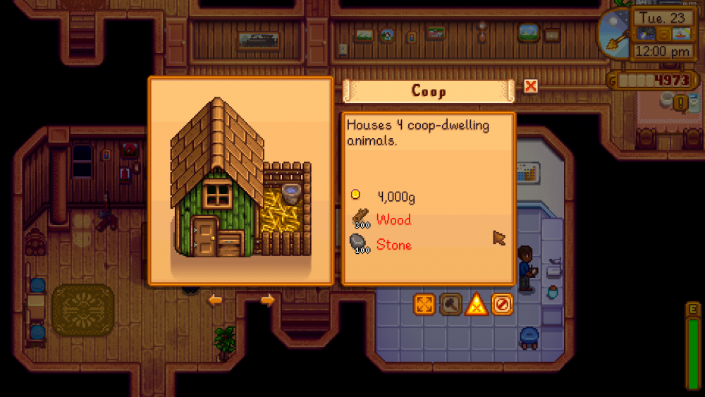
It took me 40 hours to figure out that there are arrows in this screen and that there are multiple farm buildings that can be chosen in this screen.
I found the buttons on the right side of the screen immediately upon opening this screen. They have some brighter colors, and the colors contrast with the floor behind the UI.
The arrows are sort of the same color as the flooring, and are small. This is probably why I missed these buttons the first idk 10 times I opened this screen? The buttons also feel kinda small.
(some context)
I thought that I only had the coop unlocked and would unlock other buildings later. After looking in the wiki, I couldn't find any requirements for constructing farm buildings and started to look for things in the shop.
I cannot give any useful suggestions because I have 0 experience with making UI.
(bigger buttons maybe, idk)
